Tuesday, April 27, 2010

David Bowie Painting- 2hr

Working on the more simplified, comic style rendering with my editorial illustrations made me want to do a digital painting.

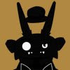
I've spent the longest time starting a painting with the airbrush tool and then building the contrast. I found I don't like working that way; I like to squint or stand back and see basically the finished painting before I clean it up. I started this painting like I would an actual painting, blocking in the values and colors. I have everything about where I want it now, so I'll start to smooth out the transitions in areas.

Wednesday, April 21, 2010

WIND!!! (Captain Planet Reference)


I enjoyed reading this editorial in Newsweek about how individuals should take action if they want to save the environment and get rid of deadwood politicians.  I'm very satisfied with the color key for this one, as well as how I resolved the windmill mess.  The subtle texture is acrylic gesso on board.  Hopefully it translates as wind.  I also added pinstripes to the politician's suit to emphasize the sleazy-used-car-salesman type he might have been.

Editorial work isn't my favorite, but I did enjoy executing this one.  I'm thinking for the next one I do, I let my love of fantasy and horror come out. 

Wednesday, March 31, 2010

Iran Bomb Finished!


Two versions of the final.  Literally just a click of the mouse and I can toggle between the two.  Personally, I like the bottom version (the one where I dropped out the black ink in favor of color lines).  I'm pretty happy with the end result.  

I've decided I'll have two methods of working for my portfolio.  The first being this kind of polished, ready for print method that is very clean and simplified (seen above).  The other method is more like the paintings I've posted from life.  I like to take the more stylized figures I do and give them a realistic rendering.  This guy gets what I'm going for:

https://blogger.googleusercontent.com/img/b/R29vZ2xl/AVvXsEjW1alZMMRYJR0w0E9S9K9pswBQH9nToK3rY5iGD7cn-dNFrJdw9JzpMzANoE8HrfcwhNNZ4R4IrUFgUlDGtIFSVHtMr_kr4XVgQ9WYuUacfp4XUDay-cKZTjK0xaWi5RIPT16jv84iSyE9/s1600/Grump17_Edges.jpg

*The artist from the link is a Disney story artist, Sam Nielson.  This guy inspires the hell out of me.

Thursday, March 18, 2010

Iran Away From That Country With The Bomb


I like this composition a lot more.  It took me at least a whole day with this new sketch because the bomb was shaped like a penis (which is fine, but it's not the statement I wanted to make).  The action and emotion is more apparent in the figures and I like the wings of the bomb as armrests (a lot more subtle than a bomb shaped crown!).  

I will start inking this one today or tomorrow and hopefully start another editorial soon.

Saturday, March 6, 2010

In honor of Where the Wild Things Are


Where the Wild Things Are is now on DVD.  I cannot give enough kudos to this movie.  The production design by itself blows me away.  I've been working on editorial illustrations for some time, so I felt like taking a break by drawing what interests me: monsters.  Not Hannibal type monsters, but just beastly, fangs and claws types.  It's great to test and push me on shape relationships and silhouettes since I'm not bound to the human anatomy.

Monday, March 1, 2010

Why Ahmadinejad and Nuclear Weapons Don't Mix.


Actually, I don't like the idea of nuclear weapons at all.  No one should have the power to do what the US did to Hiroshima and Nagasaki.  The article came from Slate and it explained why it's a bad idea for Iran to have enriched uranium leading to nuclear weapons.  Ahmadinejad has always worried me as a leader, since he pledged to dismantle the state of Israel.  Now imagine this zealot with a bomb.  Yeah...scary stuff.

This is kind of a rough sketch (for me).  You can see some things I haven't worked out (the playdoh clump I call Ahmadinejad's hand), but overall I like the mood and the composition. I'm trying to work faster, which means I have to do battle with the perfectionist in me. 

P.S.- There's some repetition of imagery in the crown.  Too much?

http://www.slate.com/id/2244428/

Wednesday, February 3, 2010

All the Colors of the Rainbow


I really wanted to play around with symbolic color.  I won't go into all of my color choices, but it was a conscious decision to have the windmills green tinted or to have the politician's suit brown in one pass (symbolizing the 70s or something outdated).  I liked the idea of the people being blue in the face from blowing so hard.  I'll look at these for a bit and then make my final decision.