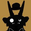
This would also go on a T-Shirt. I really like this one more than the organist because characters (cat characters!) are the focus of the image. I found out that my two favorite things are texture and shape from this piece. I really revised the characters in the final sketch to get a nice silhouette. I notice a lot of my peers using textures pulled from online texture libraries and I didn't like how things kept reappearing. A friend and fellow illustrator makes her own textures; I like to paint mine. Both solutions are infinitely better than using an image bank for texture.
Friday, December 5, 2008
This would also go on a T-Shirt. I really like this one more than the organist because characters (cat characters!) are the focus of the image. I found out that my two favorite things are texture and shape from this piece. I really revised the characters in the final sketch to get a nice silhouette. I notice a lot of my peers using textures pulled from online texture libraries and I didn't like how things kept reappearing. A friend and fellow illustrator makes her own textures; I like to paint mine. Both solutions are infinitely better than using an image bank for texture.
Sunday, November 9, 2008
 It's good to be back :) Here we have a multi-limbed organist with a Dickensian city as his instrument. Silly me, I did a lot of character development for the organist and you don't even see his face.
This is my entry for the Savannah Music Festival's T-Shirt contest. Actually, this is the illustration which was modified for their template and palette of shirts. So the end result would be a little different. I'm pleased with both. Generally the music festival gets a great number of artists submitting some very colorful, upbeat designs. My favorite last year was from Jeff Powers, an illustration major, who did an anthropomorphic tree playing a cello.
Tomorrow I'll probably post the development work that went into this one. And since I left myself some time before the deadline, I will probably get another one done.
Thursday, October 23, 2008


Last week I went and revised the characters in my story. I know, stop working on characters and get to illustrations! This is the end of character work for a while, and it was helpful for me. I learned a lot about character design this summer from combing over websites, interviews, art of books, and a very thorough book on character design for animation.
One very practical idea I gleaned from my research is that characters should not be designed in a vacuum but in a group if that's where they'll appear. So I started with the girl (probably the cutest and most innocent element of the story) and then followed with the papa monster who appears to be the most grotesque and worn of the characters. I played with scale, detail, and color in relation to each character. Putting them all in a lineup at the end was the most fun for me (even if the little monster got his foot clipped by some accident).
Right before I started work on an illustration for the savannah music festival, I experimented with how I paint things in Photoshop. The two characters under the scale chart took about 1-2 hours in Photoshop. I like my color and rendering choices but there's still room for improvement. Hopefully after I get this illustration done for competition I can devote some more hours to practice and make some nice additions to my portfolio :)
Friday, September 26, 2008

This started out as a sketch of an alien priest that would have had a following of little alien parishioners behind him. Then a combination of the way the drawing was going and something I was listening to in the background made me change my idea (wish I could remember what I was listening to).
I pictured the guy as a thespian and turned him into "Alien Hamlet" with an alien skull of Yorick (Jen really liked that part). It's amazing when you don't have a plan and let the drawing take you on a ride. This could have easily become another drawing and another world. It's fun to think about the Chaos Theory and how any number of drawings could develop based on external circumstances and whatever flotsam in your brain comes to focus at the time.
Thursday, September 25, 2008
 I decided to do illustrations in my sketchbook as well as random characters. It's good practice and it really focuses my mind on making something unified. Today I started with Miyazaki in my head and came up with a robotic scarecrow that would patrol the cornfields instead of standing there with a pole up its back, being mocked by birds. The mixing of such advanced technology with very quaint, old fashioned clothing and people interested me. Eventually robotics technology will come to every part of the world!
Tuesday, September 16, 2008


 These are the last of the "lost sketches". I am caught up now (finally). You'll notice that sometimes I don't fully commit to a drawing and leave it at the blue line. If I'm not enjoying where the drawing is going in the initial stages, then the touch ups won't change my mind. Abe Lincoln Alien was fun to draw :).
Monday, September 15, 2008


These sketches were done within a couple of days of each other. Just playing around with body types and exaggeration. Haha, I think the old man superhero has a passing resemblance to Dwight from the Office. Maybe I'll run with that. Super Raptor is definitely going to appear again (I love him too much).
Sunday, September 14, 2008


Starting today I dated the things I add to my sketchbook so this wouldn't happen. I have a good third of a sketchbook with only a vague idea of what was done when. I know these happened sometime in July and August! I'm calling these "The Lost Sketches" because it sounds mysterious and cool (plus I love LOST). Expect more in the next couple of days.
Saturday, September 13, 2008
We've been...jammed!
I have to apologize right here and now for neglecting this blog. It ends now. I like a blog for its ability to update easily (unlike a site) and I should be posting all the things I've been doing. It's the responsible thing to do. So over the next few days I'll be uploading quite a few things. Starting with this....

Here's an image I submitted for a t-shirt for threadless.com, a great website that utilizes artwork from its community for shirts and prints. Users vote on shirts (whether this has any bearing on the decision to print something remains to be seen) and the winner gets store credit and a sizable monetary prize. Overall this was a good experience (even if my shirt wasn't selected) because it forced me to work in a limited color palette (under 8 colors) and the community was very active in giving me feedback. I'll probably make another one or two designs before the year is out.
 This is what I came up for a dragon gentleman. I resisted the urge to give him a flowing cape and a button down vest. He has flow and a good silhouette, but I felt he was a bit bland...
 Here's where I took that design that I was somewhat satisfied with and tweaked it to give him more style and personality. Number 3 ended up being my favorite of the bunch and I added in the wings of the first (Jen's suggestion <3)

 Two different solutions to the same visual concept, a chivalrous dragon challenging a knight or king to a duel. The top one seemed to be more iconic which is why it ended up as the chosen one. All I had to do now was fix the dragon to make him more dynamic and involved in the action. I went to Kinko's, blew up my sketch to finished size (roughly 10 x 13) and added color in Photoshop.
I spend a considerable amount of time in pre-visualization but I think it's worth it if I can explore all the options and really flesh out a character.

Here's an image I submitted for a t-shirt for threadless.com, a great website that utilizes artwork from its community for shirts and prints. Users vote on shirts (whether this has any bearing on the decision to print something remains to be seen) and the winner gets store credit and a sizable monetary prize. Overall this was a good experience (even if my shirt wasn't selected) because it forced me to work in a limited color palette (under 8 colors) and the community was very active in giving me feedback. I'll probably make another one or two designs before the year is out.
 This is what I came up for a dragon gentleman. I resisted the urge to give him a flowing cape and a button down vest. He has flow and a good silhouette, but I felt he was a bit bland...
 Here's where I took that design that I was somewhat satisfied with and tweaked it to give him more style and personality. Number 3 ended up being my favorite of the bunch and I added in the wings of the first (Jen's suggestion <3)
 Two different solutions to the same visual concept, a chivalrous dragon challenging a knight or king to a duel. The top one seemed to be more iconic which is why it ended up as the chosen one. All I had to do now was fix the dragon to make him more dynamic and involved in the action. I went to Kinko's, blew up my sketch to finished size (roughly 10 x 13) and added color in Photoshop.
 I spend a considerable amount of time in pre-visualization but I think it's worth it if I can explore all the options and really flesh out a character.
Sunday, August 17, 2008


 I've decided to post the warm up sketches I do (almost) every day. I got the idea from the late Mike Wieringo (Tellos, Fantastic Four) who kept a blog where he did a full character illustration a day. I'm not quite that fast yet, but I'm working on it. God bless Mike Wieringo, he really made me get excited about drawing every day for yourself.
Here's his blog/site, which is still maintained with his last post intact.
http://www.mikewieringo.com/
Wednesday, July 9, 2008

 That's the end of a massive upload. Thanks again to my girlfriend Jen for reminding me to do this. :) This guy is the dreaded music teacher. I looked at Beethoven, Handel, Vivaldi, Bach, and many other classical composers for inspiration (and oddly enough, the shape of a metronome). He's a frustrated man that likes order and dislikes a wrong note. Villainous? Maybe. My imaginary backstory for him is that he wants to be a court composer but is stuck teaching rich brats their scales and arpeggios.

 Being a children's book, you usually need a kid in the story (that's how it goes). She is a girl (8 or 9) living in the 17th century. She's fairly affluent and is getting to the age where she is forced into being "accomplished" (painting, calligraphy, piano, etc...). I imagine she doesn't like taking piano lessons and is terrified of her teacher. That's not to say she isn't fond of music, she just doesn't like the anxiety associated with playing perfectly. I picture her as clumsy and kind of a tomboy, which is at odds with her environment.

 Here's the son of the creature in the previous post. This is for a children's book, so I upped the cuteness factor, I think. I looked at a lot of reference material of pianists and composers since this little guy is a proficient virginal player (a precursor to the modern piano). This design was fun because he's basically a smaller, rounder, and softer version of his daddy.


 Hey gang! I have been working on new work during the past few weeks but have been lazy about getting things posted (thanks Jen for bugging me about it!). So my project right now is a children's book that I either hope to self-publish or get picked up by a publisher. In any event I'll have some more pieces to add to my portfolio. This guy is a creature that lives in a bog or the moors if you like. He's a run-down father of many little monsters. I'll elaborate more on him when I've added color. The rest of the characters are coming during the week.
Friday, May 16, 2008

 This is my first outing in the world of self-promotion. I found it really hard to create a corporate identity for my art. What I ended up doing is making as list of my favorite artistic subjects and combined them to make a logo. I'm really fond of the detail in the original drawing, but at the same time it seems really complex for a logo. And so I simplified it to a (almost) silhouette. Anyway, I expect to do other things besides monsters in the next couple of weeks so....watch out!

I thought this was insanely clever when I first conceived it. A kid is afraid of a monster under his bed so he gets a bunk bed for Mr. Scary to sleep on. The idea is that the monster you don't see is more frightening than the one you do see. Of course, a T-Rex seen is as terrifying as one not seen. Ultimately this image will be in my senior show and will represent my style and subject matter to potential clients on my promo card.
P.S.- this image might take a while to load.
Wednesday, April 16, 2008


I whipped this up this morning for my portfolio to be sent to Pixar. That makes me sound like a braggart. Actually this marmoset (or monkey) was created a year ago for a book I was working on about a naturalist who crashes on this Alice in Wonderland type island and documents what he finds. I guess that would make this guy Mr. Caterpillar. I wasn't happy with that design so I took some elements and completely redesigned him. This version drinks the other one's milkshake.
Sunday, April 13, 2008


 So here's the story with this kid. He thinks he is Napoleon Bonaparte or something resembling him. I'm sure his parents have "encouraged" him to the point where conquest of Europe seems within his chubby grasp. I also thought it would be funny that the figurehead of the Napoleonic Wars (demonstration of Europe's naval power) would be wearing water wings. And a beach towel. Anyway, I might do a few versions of the neutral pose in color and maybe an illustration involving him and a so far unnamed adversary.
Tuesday, March 18, 2008
 I guess I named this blog appropriately, no? Monsters. This time the villagers, impressed with the Baron's story and construction of him (in the previous post) decide to expunge the demon, who is actually just an animal that unfortunately looks like a demon. This is just a value study with the final drawing; hopefully by week's end I'll have the final illustration along with the character turn-rounds for my story.

Monday, March 17, 2008

Subscribe to:
Comments (Atom)